Ball Bearings Magazine
Creative director and editorial designer (2019 – 2020)
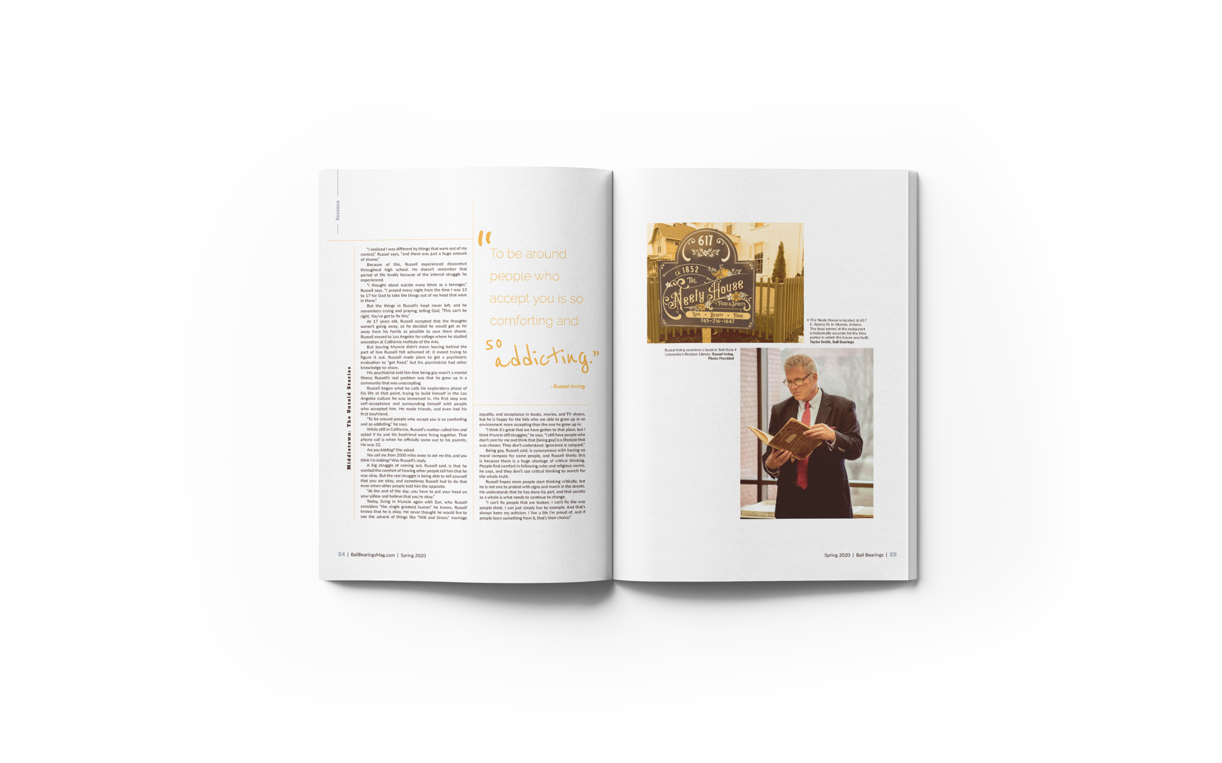
I led a redesign of Ball State’s student-run magazine in 2019 and tackled the overall design and layout of the magazine. I also created illustrations and graphics as needed.
Spring 2020: The Muncie Issue
The problem:
For the spring issue of Ball Bearings, our team faced the challenge of turning on a dime to working remotely due to the COVID-19 pandemic. We collaborated to gather visuals, finish stories and design a whole magazine – all from home.
View the digital magazine →
My role:
For this issue, I designed just about every page and created all illustrations. I also made minor tweaks to the overall style of the magazine, something I overhauled with a redesign during the fall of 2019.


Fall 2019: The Generations Issue
As the editorial direction of Ball Bearings Magazine started to shift, the design style was quick to fall behind. The editorial board was starting a new lifestyle section and focusing on the topics that were important in the Ball State and Muncie community, so the magazine was in need of a style that reflected this change in content.
View the digital magazine →
My role:
When I was hired as the 2019-2020 art director for Ball Bearings, I made it my goal to lead a redesign of the style. I had tossed some ideas around in my head regarding things I noted as a staff designer that could use an update, so I was excited to take on the challenge myself as the art director.

The redesign:
The dark blue was Ball Bearings' logo color in the past, so I decided to stick with this for the sake of some sort of consistency (I did ditch the yellow-cream color that used to be paired with). I then threw in a lighter blue that took notes from the dark "Ball Bearings Blue," as I like to call it. I also threw in a blue-grey for a neutral. The icing on the cake – in my opinion – is the lime green. I wanted to take a risk and really make it pop, so I figured what was better than the brightest green I could create without making it look like a highlighter.
In the Spring 2020 volume of the magazine, I did expand the theme colors to reflect a well-known mural in Muncie, but was able to keep the same brand identity through the blues.
The new branding update also included a couple of new logos to use on social media and online to keep the same consistency that I was aiming for with the redesign to begin with.
(Spring 2019 cover)

(Fall 2019 cover)


